 New Zealand
 Australia
 United States
 United Kingdom
 Ireland
Behind the Colors
The Landscapes That Brought Our New Colors to Life
Designing is in our DNA at Autex Acoustics. Whether we are creating innovative new acoustic solutions, creating bespoke solutions for architects, or adding new colors to our palette, we have a clear process that we follow.
This approach has sustainability at its core, helping to ensure that we can provide practical solutions for architects, installers, and those living around our products. Our most recent additions to our range are our four new nature-inspired colours: Canyon, Caspian, Highland, and Terrace.
These colors have been expertly curated to expand our palette and provide you with even more design possibilities. Each hue is a representation of natural architecture from around the world, allowing you to bring the best of nature indoors. Available for all of our products, including Cube™, Composition®, Frontier™, Lanes, and Quietspace® Panel, you can embrace these new additions in any form. Read more about the meaning behind these colors below:
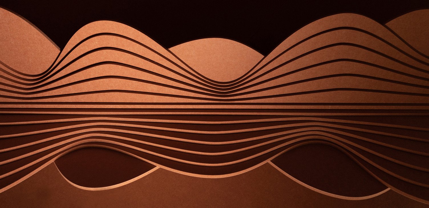
Canyon
Taking inspiration from the sunbaked cliffs of the Grand Canyon, this hue is truly a welcoming feature. Canyon is one of those warm and inviting hosts; its sunny undertones make it most at home with its warmer friends, but it can also coexist with cooler hues, making it an accommodating color that energises a space. A dash of pink enlivens this softly sun-baked terracotta. A color reminiscent of summer, this friendly orange hue will add a sense of space and light to your surroundings.
Caspian
Named after the Caspian Sea, this dark color captures the mysterious and elegant features of the world’s largest inland body of water. Hovering between grey and blue, this stormy hue can be dramatic or subdued, depending on the environment. An alluring alternative to charcoal, deep green base notes make this complex color a chameleon capable of transforming a space. Stormy sea blues such as Caspian can be both quiet and compelling depending on the light or the colors it is combined with.
Highland
The rolling Highlands of Scotland are the inspiration for this subtly warm and delicately mossy green. This muted earthy tone mimics a warm neutral and will revitalise a space without overpowering it. Green, in any form, is an uplifting and restorative addition to your environment and your mood. Increasingly, we are turning to tones of green that are reminiscent of nature and work to counter the external chaos.
Terrace
The pink and white terraces were a true wonder of the world before their destruction in the eruption of Mount Tarawera. These geothermal springs got their names from their coloring created by the unique combination of minerals found in the area. It is this calming and therapeutic pink tone that we take inspiration for Terrace. A subtly hued alternative to warm grey, this dusky purple tone combines warmth and lightness to create a color capable of illuminating a space. Soft grey undertones ensure this shade is a sophisticated version of a traditional mauve.
Sample Request
The best way to choose is to experience it. Order a sample to explore the colors and textures up close.
